Putting Braintree on the Map
Here at Braintree, our merchants have stored over 35 million credit cards in our Vault, allowing their customers to seamlessly checkout without having to re-enter their card info. We wanted to create a beautiful visualization to show us where all of these cards are located. Always mindful of this lesson from xkcd, we wanted to know if our vaulted cards are distributed just like population density, or if, as we suspected, our merchants' customers are disproportionately urban, early-adopters.
To investigate, we used R to plot the location of our vaulted credit cards based on their billing zip codes and mashed that up with data from the 2010 US census. We encountered lots of intricacies and pitfalls along the way-from the type of map to use to the distinction between a zip code and a census ZCTA. We'll walk you through some of the steps we took to produce beautiful maps with R. The full R code, in all its nitty-gritty detail, can be found here on Github.
Preparing The Data
We started by querying our sharded Postgres database to pull all of the zip code info for our vaulted cards. We decided to do the data cleaning in R, but it's just as easy to do it in SQL. First, we looked for zips that had the format of a zip+4 (like 60606-7202) and truncated them to keep only the first 5 digits. Next, we threw away any zip codes that weren't 5 digits. Finally, we threw away any leftover zips where the customer listed a non-US country, just to be safe.
If you're reading your zip codes into R from a csv file like we are, remember to read them in as characters using the colClasses argument of the read.csv function so that leading 0's don't get dropped.
Mapping Points
In the first iteration of the map, we wanted to try a single point for each card. Luckily, the zipcode package in R provides a dataset that links zip codes to their latitude and longitude coordinates. We merged this data into our card dataset and plotted it using the good 'ol points function on top of a map from the maps package:
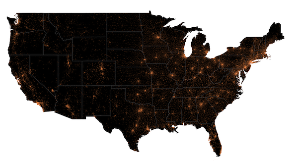
One problem with this approach immediately became clear: the discrete nature of the zip code lat/long pairs made the graph look choppy. All the cards from a single zip were plotted on top of each other at a single point. We tried adding a random amount of lat/long jitter to each point, and the result was pretty good (click through for the hi-res version):

Heatmaps
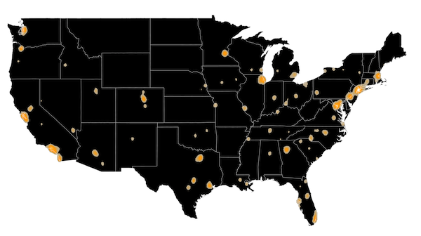
Still, it's hard to get a real idea of the density of cards with a map like this, where so many points overlap in tiny regions. Our next thought was to use a heatmap. The spatstat R package has tools for creating smoothed density functions from a collection of points. Basically, the density function runs a gaussian (or some other smoothing function) across your map and counts the points that fall inside. The result looks pretty good, but it really tends to overemphasize the cities (click through for the hi-res version):
Expert tip: with so many points, we found that feeding all of them into the ppp function, which is needed to form a points dataset for spatstat, was extremely slow. It's much faster to pre-aggregate the data, adding up all the cards in a given zip, and then using the weights argument to the density function to weight each point by the number of cards.
Choropleth Maps
Still, what we really wanted to do was to compare our vaulted card density to population density. So we grabbed a few datasets from the 2010 US Census. This is when we learned that the census doesn't deal with zip codes. A zip (which apparently stands for "zone improvement plan") isn't really a geographic area. It's basically just a list of addresses used to deliver mail. Instead, the census deals with ZCTA's, or "zip code tabulation areas". Sometimes there's a one-to-one mapping between a zip and a ZCTA, other times the relationship is more complex. To map zip codes onto ZCTA's, we grabbed this file and merged it into our data. We also grabbed the 2010 census gazeteer file, which has stats for each ZCTA like population, land area, etc.
Finally, we needed to be able to map the boundary of each ZCTA, so we grabbed the ZCTA shapefile from the census. The shapefile describes all of the boundary lines in a geometric fashion so they can be easily plotted. R's maptools package has functions, particularly the readShapeSpatial function, for reading shapefiles with R.
The SpatialPolygonsDataFrame object that comes out of readShapeSpatial has two important slots: one is the @polygons slot that holds actual ZCTA boundaries, and the other is the @data slot that holds a dataframe, one row for each polygon. We learned, after much pain and suffering and wailing and gnashing of teeth, that it's extremely important to maintain the alignment and row-naming between these two slots. See the code comments for all the nasty details.
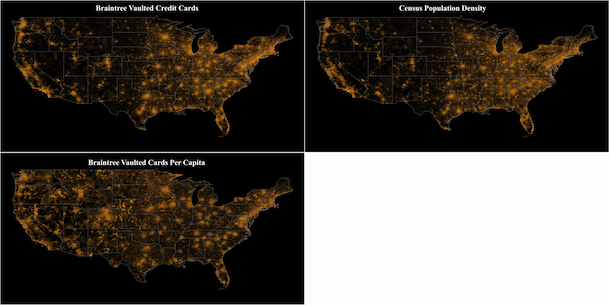
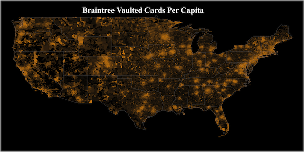
The GISTools package in R has a choropleth function for making really nice looking choropleth maps (maps where the color of an area denotes some quantity). The maps below show our vaulted card density, the census population density, and vaulted cards per capita (click through for the hi-res version):

So What Did We Learn?
It's clear that the cities are much more pronounced in the cards per capita map. That is, our vaulted cards do tend to be disproportionately concentrated in large urban centers. Of the top ten ZCTA's in terms of vaulted cards per capita, two are in San Francisco (the top ZCTA is the Marina and the fourth is Potrero Hill/Dogpatch) and one is outside of San Jose. Two of the top ten are in Boston, one is in Austin, and two are in Los Angeles. So our suspicions were confirmed: our vaulted cards are pretty dense in tech-saavy early-adopters. Next on our list: individual maps for various Braintree merchants. We won't be blogging about that, since we take our individual merchants' data privacy extremely seriously and that kind of data is for their eyes only.
Notice anything interesting buried in these maps? Care to speculate on what patterns might emerge for individual merchants? We'd love to hear from you.
