This post is the first of a series where I will be detailing how to provide users with the best custom credit card form experience in the business.
Ever since we launched our v.zero SDK with the Drop-in UI in July last year, I’ve been in love with all the little user experience tweaks that our design team incorporated into our credit card forms. As a speaker at dev conferences, I have a lot of fun referencing these small tweaks by highlighting how bad a credit card form UX is without them. If you’re not yet familiar, here is a little example of our Drop-in in action:
Last month we launched Hosted Fields, our brand new solution to the latest PCI requirements. This is an awesome way to fully customize your credit card form to your liking while still processing the card data with full v.zero security. The new API comes with some very powerful features that allow you to replicate the cool UX features from the Drop-in UI into your own form. I recommend reading our previous post by Kyle DeTella for the full background as to why we designed these APIs the way they are.
Now, onto Hosted Fields and the power of customization. Let’s look first at adding a card validation warning.
Card validation warning
One of the things I love about the Drop-in UI is how it instantly notifies the user that a card number is invalid by adding a red bar under the field and changing the text to be red. In our Hosted Fields API there are 2 ways to achieve this same effect. Let’s look at the simplest one:
<form id="example-form">
  <div id='card-number'></div>
</form>

<!--
Switch to the result tab to try these.

These are valid numbers:
 * 5555555555554444
 * 4111111111111111

These are invalid numbers:
 * 5555555555554445
 * 4111111111111112
 * notanumber
-->
See the Pen Braintree Hosted Fields - Card validation by Braintree (@braintree) on CodePen.
This example uses 2 features from the Hosted Fields API. The first one automatically adds the .braintree-hosted-fields-invalid class to the outside wrapper of a field. It also adds a simple border-bottom-style to create a red border under the input field.
Additionally, the following code is added to the Javascript that initializes our Hosted Fields to automatically make the text in the field turn red:
braintree.setup(clientToken, "custom", {
  id: "example-form",
  hostedFields: {
    number: {
      selector: "#card-number",
      placeholder: "Card Number"
    },
    styles: { // custom styles
      '.invalid': {
        'color': '#D0041D'
      }
    }
  },
});
As you can see both of these solutions are very declarative. I do not need to update the UI myself, instead I rely on the v.zero SDK to inform me of changes. I’d like to point out that the v.zero Drop-in UI also uses a very clear, fluid animation to shake the form and bounce the bottom border. The animation is a bit complicated for this example, but I recommend looking at this animation tool that helped us create the effect.
Card type detection
Aside from the declarative styles added by our SDK, there is another way to interact with the custom fields. In every Hosted Field interaction, a Javascript event is triggered that we can subscribe to. I could have used this in the previous example to observe the event.isValid attribute, but that would have been more code to achieve the same goal. Instead, I can use this event to detect the credit card type and then display a small icon on the form to signal to the user that we have successfully detected theirs.
<form id="example-form">
 <div id='card-number'>
  <span class='icon-type'></span>
 </div>
</form>

<!--
Try any of these numbers:
 * 371449635398431
 * 6011111111111117
 * 6304000000000000
 * 5555555555554444
 * 4111111111111111
-->
See the Pen Braintree Hosted Fields - Card Type detection by Braintree (@braintree) on CodePen.
The first change I make here is to update my Hosted Fields Javascript setup code to pass in a listener for the onFieldEvent-event. This handler then receives an update every time the content of the card field changes significantly. An extra class is then added to the icon-type element if it has detected the credit card type.
handleFieldEvent = function(event) {
  console.log((event.card));
  iconType = document.getElementsByClassName("icon-type")[0];
  iconType.className = "icon-type";
  if (event.card) iconType.className += " icon-type-" + event.card.type;
}
To finish things up, I add a few CSS styles that point to a custom-built sprite containing some of the credit card logos, updating the location in the sprite for each card type. This approach is less declarative than the previous example, but it does provide you with a lot of additional data. Have a look at the full documentation for more details.
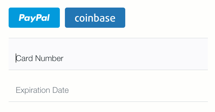
In my next post, I will cover a few more small UX tweaks that will allow your users to fill in your credit card forms with ease, including adding a PayPal button and creating floating labels. In the mean time feel free to reach out to me on Twitter, I would love to know what your favorite design elements of our credit card forms are and what features you would like for me to cover in future posts.