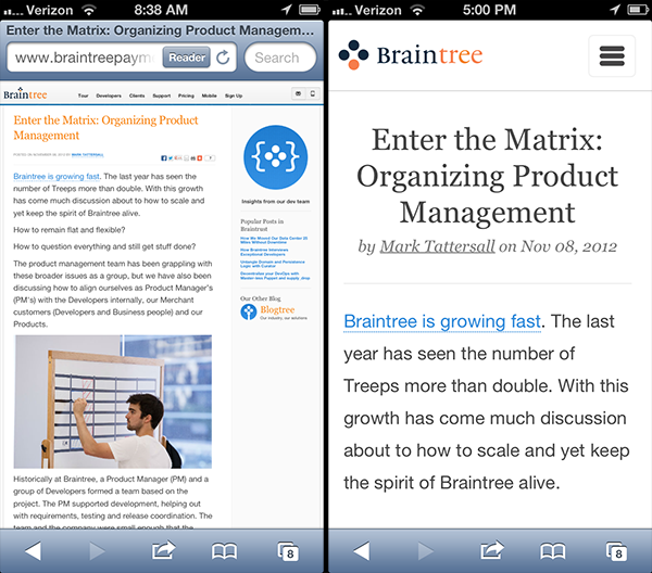
The Braintree blog receives more mobile visitors than any other area of our site. This makes sense considering posts are often shared on other sites and read on the go. More and more of our readers will be viewing our content on devices other than desktops. At the time of writing, 23% of blog traffic is mobile, and yet our reading experience has been less than ideal for tablets and mobile devices. It was time to make our blog responsive.
Design goals
This was our first run at the blog in a while. We took the opportunity to grab the low hanging fruit and improve the experience as much as we could for our visitors arriving on anything from mobile to desktops. A major goal was to reduce visual noise. We eliminated distraction in order to draw more focus to the content. We cut down on color use and only reveal certain elements when they are needed. Comments and the "subscribe" email input will take a click to reveal, but not everyone wants to use them. The majority of readers won't need them, but they are there if you do.
At Braintree we have a healthy flow of blog posts going out. We emphasized the published dates for each post to help better show the frequency of posts. The new treatment also acts as a visual marker for each separate post, making any single one more identifiable in a list.
Our blog gets more external referrals than any other portion of our public site. So as an entry point for many who are not familiar with Braintree we decided to make an introduction and highlight the amazing companies we work with and how to learn more about us. A large number of very talented and curious readers visit our blog, many of which we would be interested in working with. We also happen to have open positions, so we definitely wanted to reach out and let readers know we are hiring.
Baby steps
When we begin looking at any aspect of our products a large number of ideas stack up. This list is often too much to tackle at a first pass. We have many ideas that go beyond this initial release. We took an iterative approach to our blog redesign as we do for many of our products. This allows us to release quickly and iterate on the design once it's out, not holding back any releasable improvements for remaining work.
Technical bits
There are a variety of ways to optimize for different devices. We chose to take a responsive approach, utilizing media queries and css to adapt to viewport size. This approach kept us clear of any device or user agent sniffing. Luke Wroblewski shared new devices announced within just two months time. You can see why it would be difficult to maintain device detection at that rate of release. These are some key snippets of code that we used to help everything behave nicely.
-
Meta tags
By default some mobile devices allow the scaling of a page. This is great for sites that are not optimized for mobile, but we're now responsive. This prevents scaling and any horizontal scrolling.
<meta name="viewport" content="width=device-width, initial-scale=1, maximum-scale=1, user-scalable=no" />
-
Media queries
We are targeting additional styles for devices that are tablet sized and for mobile. We also have a query for any styles we wish to share between the two groups.
@media screen and (min-width: 1px) and (max-width: 1023px) { /* mobile and tablet shared styles */ } @media screen and (min-width: 768px) and (max-width: 1023px) { /* tablet styles */ } @media screen and (min-width: 1px) and (max-width: 767px) { /* mobile styles */ } -
Prevent text adjustment for iOS landscape
By default iOS scales text when the device is held at landscape. Let's prevent that and retain control of font size.
body { -webkit-text-size-adjust: none; } -
Word break
With the increased font size on mobile, we ran into links often running longer than HTML containers and breaking the layout.
a { word-break: break-all; } -
Forcing hardware acceleration
Animations in the browser can be a little rough. We can force hardware acceleration and smooth things out a bit by applying a 3D transformation to the animated element. http://www.html5rocks.com/en/tutorials/speed/html5/
#res_nav { -webkit-transform: translateZ(0); } -
Prevent tap highlight on iOS
iOS adds a visual indication that something was clicked on with a colored highlight over the element. This is nice for some interactions, but for larger areas it doesn't feel right to see the flicker. We prevent this flicker if you tap back on the content when you have the mobile menu expanded.
#closer {
  -webkit-tap-highlight-color: rgba(0,0,0,0);
}
Responsive images
Images needed to scale nicely within a variety of layout widths. This is not the best way to serve up lighter assets in file size for mobile, but It does offer a simple way to scale our legacy images without recreating them.
img { max-width: 100%;}SVG backups
When we started looking at different screen resolutions it was just simpler to not worry about them at all. SVG is vector based and allows us to not worry about different DPIs or any new screens going beyond the resolution of our assets. Not all browsers support the file format so we used Modernizr to detect support and serve up an alternate image if needed.
<img src="/content/braintree.svg" type="image/svg+xml" alt="Braintree Payment Solutions" data-svg-alt="/content/braintree.gif" />
function svgAlt(a){
  $(a.selector).each(function(){
    $(this).attr('src', $(this).data('svg-alt'));
  });
}if (!Modernizr.svg){
  svgAlt({ selector : 'img[src*=".svg"]' });
}
Fontcustom
Maintaining icons can be a pain. It is an even larger pain when also supporting high DPI displays. This is a utility to generate a custom web font from svg assets. Fontcustom provides all the technical benefits of an icon font without the hassle of creating and maintaining a traditional font. Fonts are resolution independent so they look great on Retina or high DPI displays. http://fontcustom.com/
Reliable full viewport height on iOS 5
While testing on older versions of iOS we ran into some interesting bugs on the height of our slide out menu. This is a javascript fix to ensure we are consistently getting the full height of the viewport. http://bugs.jquery.com/ticket/6724#comment:1
var height = window.innerHeight ? window.innerHeight : $(window).height();
Next steps
We hope this first iteration makes for a much better reading experience on our blog. We especially want this to be true for mobile users that are quickly becoming more of our readers as a whole. These changes were a first step towards a number of improvements we will be making to our blog and towards having mobile in mind for the rest of our site. We are excited to see what will work well and what doesn't. We won't have everything perfect just yet, but we will learn from it and iterate in hopes of bringing you the best experience possible.