Braintree's API is a powerful tool for our customers. It delivers great simplicity coupled with a deep feature set, allowing our customers to grow with Braintree as their business grows and their processing needs inevitably becomes more complex. However, I feel like we are not doing a good enough job of introducing the API in its simplest form to new developers. I have therefore been working on a new Getting Started Guide to help bridge this gap between a Braintree API newbie and processing your first transaction.
Having identified this gap, I started by researching other well respected API's to pick up any patterns and best practices that we could utilize to make the Braintree Guide the very best experience possible. The Guide will be released shortly, we are entering a testing phase now, but I wanted to share the results and conclusions of my research, and to also solicit any feedback from the community on the great and the not-so-much API document experiences developers have encountered.
Best Practices
Programmable Web is a great resource to stay on top of the the API space, and they had a good article about best practices, with a very informative diagram:
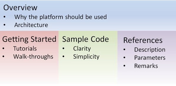
This highlighted what we already knew, we were missing the Overview and Getting Started sections.
Over the course of the resulting research, I arrived at the following 4 conclusions:
- Provide a clean and visual overview page
Twilio is generally recognized as having one of the most accessible and comprehensible API documentation, and is held as a gold standard by many. They do a great job with their overview page:
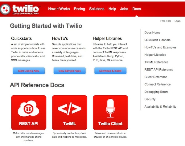
I particularly like the large icons and how they clearly delineate between “Quickstarts” which are simple Tutorials and “HowTo’s” which are use case specific sample applications.
The Facebook Developers platform also has a great Developer landing page providing a nice overview:
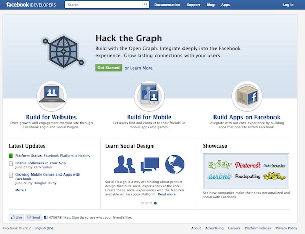
Then their Getting Started section also laid out clearly what their documentation includes:

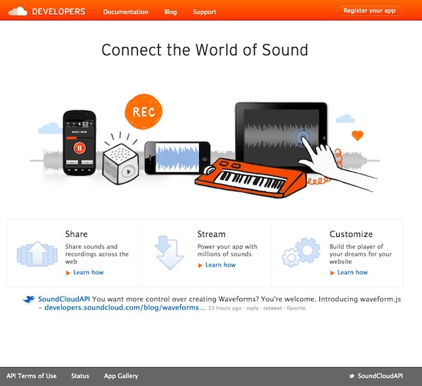
Soundcloud just took the 3 use cases they are catering for and made that the sole focus of their Developers landing page.
Notably these are links to articles, and not true get started guides or the full API reference documentation. So I don't think this is a good pattern, but I like the clean nature of the Developer landing page and how the use cases are front and center.
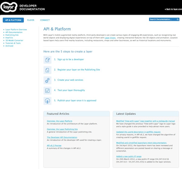
Layar took a step guide approach that would translate well to the payment gateway space:
- Focus on use cases
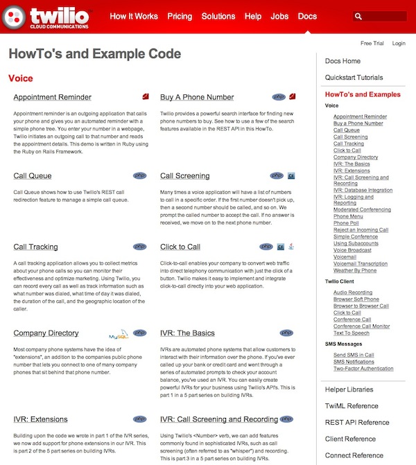
Again Twilio does a great job, with a full page of examples of how to achieve key use cases for their service. Below is just a snapshot, the page is twice as long, but you can see the full list of examples is listed in the right nav.
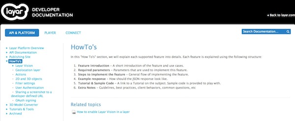
Layar has a HowTo section, with step-by-step guides through common use cases. They also provide a “HowTo” introduction page outlining how each each tutorial will be structured. Notice #1 is the use case for the feature, and how it will be used.
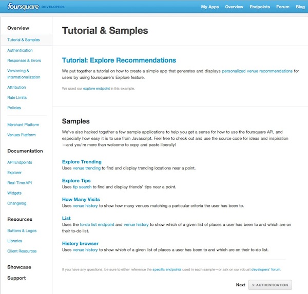
Foursquare has a nice informal tone, talking about a few sample apps they have “hacked” together to show how you can use Foursquare:
- Offer reference or summary pages for core concepts and best practices
More than an FAQ, there should be a some page or area that speaks directly to the Developer and outlines a broader perspective on the API. It's a place to help direct the developer down the happy path, but also a place to demonstrate expertise.
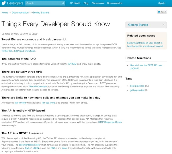
Twitter uses a Things Every Developer Should Know page:
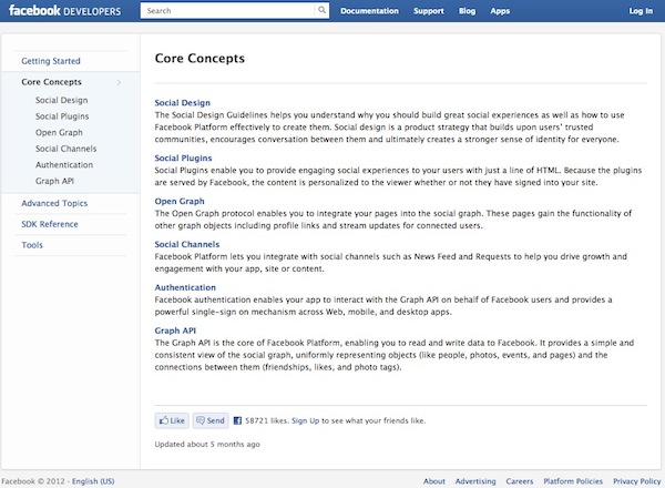
Facebook has a nicely detailed, and very professional feeling Core Concepts section with multiple pages underneath:
- Break the monotony
When you are actually on a tutorial detail page the emphasis must shift to code samples as much as possible. But this should also be paired with call outs, diagrams and highlights to break the textual monotony and emphasize important points, gotcha's and cool features.
Klout has one of the most attractive detail page designs, making great use of code samples and highlights, as well as a prominent call to action to sign up at the top of the page at all times.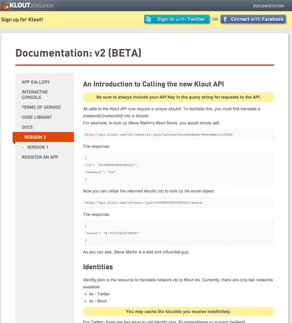
Rails Guides also makes excellent use of callouts, using different icons and colors for warnings versus hints and tips:

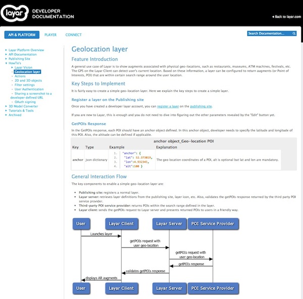
Layar also used diagrams wherever possible, such as on the Geolocation HowTo detail page:
You can also find a great list of API documents on Mark Phllips' GitHub - https://github.com/PharkMillups/beautiful-docs. I hope our documentation improvements over the coming months will win us a place on this list!
I also found this article on Documentation Usability to be very informative, and something to which I am constantly referring.
Please leave a comment and let me know of any other best practices, anti-patterns or documentation examples you enjoyed or otherwise.